Upward Mobility
Published: Aug. 21, 2022Prepared by: Rachell Calhoun, David Coe, Liz Giancola, Lauren Wolf
Introduction
Americans tend to think of upward mobility both in terms of employment and on an individual level: achieving the American dream of a rewarding career and thriving family. For most people, this means increasing their income, moving up the economic ladder, and advancing through the American class structure. However, for that to happen, a system of support networks needs to be in place. For example, children who experience quality early learning programs earn 25% more in wages as adults (Gertler, 2021). Therefore, a strong infrastructure around early childhood education has the potential to support future generations’ upward mobility.
For policymakers to enable this process for both families and individuals, we must shift our focus away from relying simply upon the relationship between an employer and an individual employee and toward the relationship between individuals or groups, and the community structures that they navigate. Facilitating community upward mobility must mean creating scaffolds of support at the community level. To understand what it would take to increase upward mobility, the Urban Institute created an expansive definition of upward mobility and a set of metrics to both quantify the current state of mobility from poverty, and to set community-level goals for improvement.
“Poverty is not just about a lack of money. It’s about a lack of power.” —John A. Powell, director of the Haas Institute for a Fair and Inclusive Society and member of the US Partnership on Mobility from Poverty
The Urban Institute describes the three key drivers of mobility, which it uses as a foundation for its measurements:
- Strong and healthy families
- Supportive communities
- Opportunities to learn and earn
Our work builds upon metrics that fall within these drivers, including violent crime rate, 20th percentile, median, and 80th percentile of family income, and percent of three- and four-year-olds enrolled in preschool. The Urban Institute has partnered with a few locations across the US to collect this data (eg. Boone and Philadelphia County). While the Urban Institute has defined the metrics and potential sources so that other municipalities could utilize them, they have not posted explicit technical instructions for retrieving the data.
We are sharing our source code so that communities that are interested in tracking their own metrics in future years can build upon our methodologies to explore this data. We created a reproducible method to retrieve many of these metrics, so that less-technical organizations will find them more accessible, and they can be updated as new data become available each year.
To our knowledge, our work is the first to collect 16 of these metrics for all counties in the US. We’ve created a website that shares national maps for all metrics, county-level metric breakdowns, and county rankings. We created the website with two audiences in mind:
- Policymakers and community leaders who may use this data to understand the current state of their communities and set goals for their future.
- Individuals or families who are interested in moving to a county with a strong infrastructure to support upward mobility.
This blog will discuss some of the challenges of data collection and cleaning, detailed definitions of the metrics, and how we ranked counties.
Stakeholder Partnership
Inspiration for this project came from a partnership with the Rhode Island Economic Policy Institute (EPI) and the Latino Policy Institute (LPI) to collect the upward mobility metrics about four cities in Rhode Island – Providence, Pawtucket, Woonsocket, and Central Falls – as a model for how this project might be used by policy-makers. Most of Rhode Island’s poverty is concentrated in these four cities; our partners at these institutions are interested in understanding what is happening in these regions, and in using this data to collaborate with policy experts to find out how they can impact it. Moreover, because inequity in America is disproportionately experienced by Black, Indigenous, and People of Color (BIPOC) communities, they were particularly interested in these metrics broken down for specific races and ethnicities. They plan to use our work as a stepping stone to apply for grants to build off of our findings. Our Rhode Island report can be found on our website here.
Obtaining the data
The data leveraged during the creation of this project was acquired from multiple, disparate sources, often obtained from various API calls or downloads. The pipeline components required to bring together these sources can be seen in Figure 1. More robust descriptions and source details are available on our website.
After retrieving all of the required raw data, and performing any necessary data manipulation and calculations, the counties_merged notebook joins the data together using the county Federal Information Processing Standard (FIPS) code. FIPS codes are numbers that uniquely identify geographic areas. The final output of the process is a county_merged.csv file. This file helps drive the Streamlit app that is wrapped by the Django website for user interaction with the data.
While there were several metrics we could not obtain, we made sure to cover at least one domain in each of the three key upward mobility drivers. In many cases, it would have required manual collection of data from multiple sites. In other cases, the data was not reliably reported for a significant number of U.S. counties.
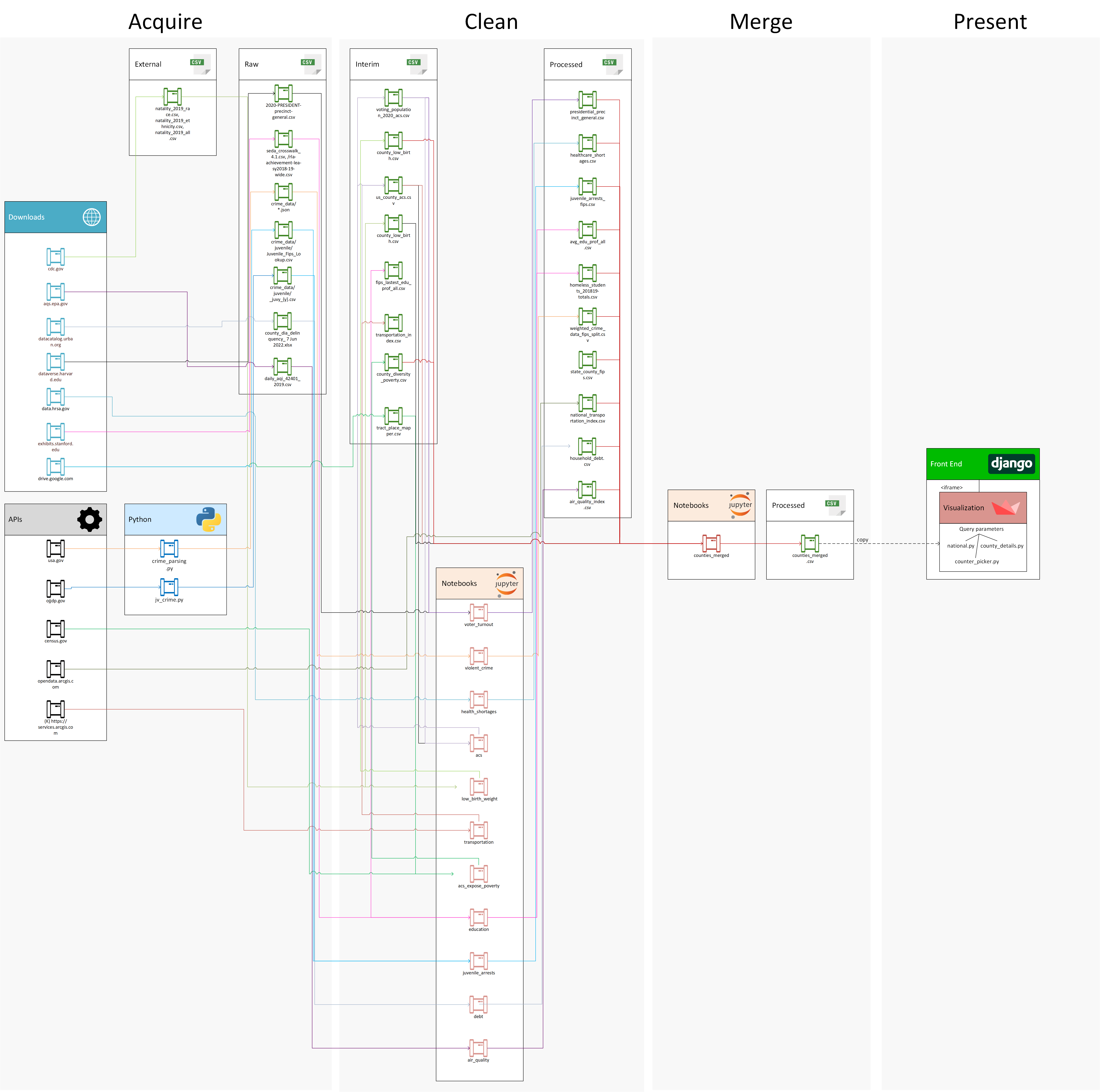
Figure 1. The data pipeline for creating the Upward Mobility project..
Visual Exploration of Data
One of the challenges explored during this project was the best way to present information to users without overwhelming them with the amount of data that was available. On the county details page, each upward mobility driver has its own page section. Within each driver, domains are presented as tabs that are activated when the user clicks on them to see the details of the domain. This experience allows the user to focus with intent on the domain area of their interest.
While each domain presents slightly different information, they follow a common pattern of individual metrics on the left, with the name of the metric, the value for that county, and a comparison to the national average for that metric. Where possible, details of the domain are broken down by race/ethnicity so users can gain additional insight on how the numbers are broken down. Finally, an expandable section allows the user to find the source details about this domain while remaining out of the way for users that do not wish to see that information. Figure 2 explains key visualization pieces of one sample county.

Figure 2. A breakdown of the Strong and Health Families section of the county details page.
Another example of design decisions we made for presenting the data is how to present the population metric for each county broken down by race and ethnicity. There could be several ways to present this data. Two are explored in Figure 3.


Figure 3. A comparison of how to present race and ethnicity data.
On the left, ethnicity is used as the parent category. Upon inspection, this creates an ethnic-centric view of how this sample county’s population is broken down by race. This is not typically how race and ethnicity data is presented. It also makes it difficult to see the very small slivers of data without the aid of a rollover on the graphic.
On the right, race is the parent category and ethnicity is the child category. This view was ultimately chosen because the Census data is also broken down in this fashion.
Upward Mobility Score
Our team was often asked about upward mobility scores to rank the upward mobility of each county. One example of a county ranking system is used by Michigan | County Health Rankings & Roadmaps. In this example, counties are ranked and scored based on various factors including the length of life, health behaviors such as smoking and obesity, or other socioeconomic factors.
The challenge with creating a single ranking is that upward mobility is a personal journey. One person's definition of upward mobility may differ from another’s. Some may choose where to live in a place with the highest earning potential. Others may choose to live based on a school system, access to healthcare, or community involvement. With this in mind, our team created a County Finder tool designed for the user to specify the top three factors that are important to them and weigh those factors from 0-100, with all three factors having to add up to 100.
To determine the top ranking counties based on the user’s input, we rescaled each metric from 0-100 using a min-max scaler. For metrics where lower values were best (ex. crime rate), we reversed the values. Some metrics did not have a universally agreed-upon best value. For those, we input a value that was generally agreed upon and re-scaled the metric so that the closer to ideal the original value is, the higher the county would score. For example, each individual has an ideal neighborhood exposure index, which is the ideal percentage of their neighbors that are of a different race than them. We set the ideal to 50%, but different users may have different needs.
Figure 4 demonstrates the usage of the County Finder tool. First, users select their top 3 metrics and weights, along with their preferred county population. Once submitted, a ranking is performed and a national map is presented to the user based on the weights that they have determined. Below the map, the user can see the top 5 counties based on their personal ranking. From here, the user can click into a county to see details about the county across the categories of Upward Mobility.

Figure 4. Demonstration of the County Finder tool.
With more time, we’d create functionality for users to input their ideal value, when appropriate. We also know that geographic regions are important to many individuals. If we had additional time, we’d allow users to input a county and only receive results that are within a user-defined distance of that county.
Data Challenges and Solutions
Viewing metrics on a national level helped identify outliers. Some data issues we identified and addressed were some counties having more than 100% voter proportion, extremely large crime rates, and instances of a very large proportion of homeless students. For each area that had extreme outliers, we investigated further and found reasonable solutions for resolving the issues.
Voter Turnout Fixes
When originally calculated, six counties were found to have voter turnout greater than 100%. To investigate the unreasonable voter turnout, we looked into the raw data, which revealed that the largest voter turnout was in Sherman County, Oregon (FIPS: 41055) with a voter turnout of 180%. This unreasonable number is because the raw data had duplicate rows with the only difference being the party identifier being included or NAN. After removing these duplicate rows, the data looked more reasonable at 89% for voter turnout.
Several of the counties that had voter turnout greater than 100% were found to have very small populations. It was determined that due to the method for estimating county population by the American Community Survey (ACS), estimates could be slightly off for counties with populations of around 400-800 voting-aged people, often undercounting the voter age and therefore inflating the voter turnout. To remedy this, we marked the counties with greater than 100% voting as NAN. With more time, we would create a confidence interval for the true voting percentage using methods outlined by the ACS.
Violent Crime Rate Fixes
The county violent crime rate metric created some interesting data wrangling challenges. We obtained data from 18,616 agencies across the United States via the API for usa.gov, the same source that powers the FBI's Crime Data Explorer. Most, but not all, agencies are associated with at least one county. However, none of the 209 Tribal agencies are associated with any counties, resulting in an undercount of the 7,575 violent crimes reported to those agencies in 2019. Another 246 agencies, mostly state police or other state agencies, also didn’t include the counties served in their reporting, resulting in another 52,772 violent crimes that are not included in our violent crime data. This represents approximately 5% of the 1,186,666 violent crimes reported in the 2019 dataset.
There are 628 agencies associated with multiple counties. For example, the East Lansing Police Department in Lansing, MI is split between Clinton and Ingham counties. There is no perfect way to split the data between counties. Initially, we assumed an even split of the data. If there are 100 violent crimes from this agency across two counties, then 50 crimes were counted for each county. However, this resulted in some crime rates that were way too high, particularly for some small counties, so we decided to instead weight the crime allocation by population.
An example of this issue was present in the data for Medina County, Texas, which has eight agencies that report violent crime rates. Of these, six are located only in Medina, with a total violent crime count of 155, and two are located in multiple counties. The first multi-county agency, Lytle Police Department, only reported 1 violent crime. The second agency, San Antonio Police Department, reported 11,046 violent crimes, to be split among two counties: Medina and Bexar. Using the equal split method would result in 5,678.5 violent crimes attributed to Medina. Using the population-weighted method, because Bexar’s population is so much larger than Medina, instead results in 431.5 violent crimes attributed to Medina. Given the population is approximately 50,000, this changes the violent crime rate per 100,000 residents from 11,357 to 863.
The scatter plot in Figure 5 displays the difference between the two methods of splitting the multi-county agencies. Most counties only have data from agencies that report to one county. As expected, these counties’ crime counts are equivalent regardless of how we split the multi-agency crime rates and all fall along the central line. You can see that the violent crime count dramatically shifts for some counties.

Figure 5. A scatter plot demonstrating the difference between the two methods of splitting the multi-county agencies.
Homeless Proportion
We calculated the proportion of homeless students using Department of Education and ACS data and noticed that Fairfax County, VA had an inflated homeless rate of 88%. In the US, over 50 cities, many of them located in Virginia, have unique FIPS codes separate from the county. This was the case for Fairfax County and Fairfax city. Because both the county and the city share a school district, the Department of Education data reported the same approximately 2,400 students as homeless in both places. However, the ACS data reported many fewer total public school students in the county than in the city. This discrepancy in reporting resulted in an inflation of both the city and state’s numbers. To remedy this, we split the 2,400 students who had experienced homelessness between the two jurisdictions weighted by the number of public school students in each location. This resulted in the reduction of the county proportion of homeless from 88% to a more reasonable 7%. With more time, we’d investigate whether the other cities that were pulled with the county data resulted in similar data quality issues.
Rhode Island School District Scores
Our Rhode Island partners at EPI and LPI helped us think deeply about the interpretability of the metrics. This was a particular challenge when measuring the effectiveness of public education when we calculated the average per grade change in English Language Arts achievement between third and eighth grades. At first calculation these came out to : Central Falls: -1, Pawtucket: -8.5, Providence: 1.8, Woonsocket: -1. We noticed a stark difference between the positive performance of Providence public schools and the decrease in performance in all other school districts. Since Providence public schools are known for their lack of support for students, as noted in the Providence Public School District Report, our initial findings didn’t seem quite right. Upon further inspection, we realized that we were over-weighting small schools, mostly public charter schools, and under-weighting the public school district in Providence. To remedy this, rather than using the mean of the school scores in the school district, we created the mean using the total number of students who took state assessments to weight each district. This resulted in negative scores for all four cities, which better aligned with our stakeholders’ intuition about these metrics.
Just as importantly, we realized that seeing the change in effectiveness doesn’t give enough context to understand the differences between these cities. We needed to help our stakeholders see that these scores don’t necessarily mean that one district is outperforming another. It only means that a particular school district saw improvement, or deterioration, over the 6 grades during the 2018-2019 school year. For example, one city could start with very low proficiency and see 5% improvement per year, while another city could have 95% proficiency each year, and have 0% improvement. The second district has higher-performing schools but appears to underperform based on this metric.
To remedy this, we created a graph of the scores over time for each school district. We color-coded by the city to bring out patterns for each city (Figure 6). This helped us realize that, while Pawtucket school districts (in purple) had the largest drop in performance, they also started with the highest average performance in 3rd grade. In addition, Providence contained some high-performing charter schools, but their public school district had the lowest performance by eighth grade.

Figure 6: A line graph displaying school district school performance
Ethical Considerations
The data we used for this project was already publicly available from various government sources, however, when data is aggregated it can often become harmful to the subjects as opposed to when it was disparate. An example of when harm could occur from our project is via the racial exposure index. A malicious actor could use this metric to intentionally seek out communities with majority-minority populations with harmful intent, or specifically choose to avoid moving to a community due to the mix of race/ethnicity.
There were many steps we took to reduce the likelihood of our work causing harm, although we know the risk is never zero.
- We adopted At The Root’s Ethical Open Source License to prohibit malicious use of our code and datasets, and avoid unintended use of our code for harmful activities.
- We partnered with subject matter experts from the EPI and LPI and consulted with them regularly to ensure that we were not presenting findings that may be biased or misleading. An example of this is related to crime rates. Our partners at the LPI recommended we focus on violent crimes and exclude property crimes because they can be disproportionately reported in high-poverty areas or areas with a majority-minority population.
- Our process is documented from start to finish in a transparent and accessible way. It could be audited by anyone concerned about bias within our process.
Future Work
Though we were able to find 16 metrics that were identified in the Urban Institute Upward Mobility from Poverty work, we did not find data for the remaining 10. This was due to various reasons like requiring the manual gathering of data, the data not being easily accessible, and the data not being at the county level. Therefore, going forward one goal would be to identify ways to get the remaining metrics from the Upward Mobility framework and implement them in this project.
Another goal going forward is to look more in-depth at a city level. We have already started talking about possibly building a Michigan city-level project based on this one. The importance of looking at a more granular level is that starch inequality can exist within a county. For example, in Washtenaw County, MI, 31% of those below the poverty line live in concentrated high-poverty neighborhoods, which is 27% higher than the national average. Because all metrics in the financial well-being domain are strongly outperforming their respective national averages, it points to being an indicator of inequality within the county. In this case, looking at the more granular city-level data might shed some light that was skewed by the county-level data.
A more practical use of this project and tool is to be able to compare two counties side by side. Given more time, we would add a page to compare county metrics in the case that a user wants to decide between two areas to live, for example.
Lastly, performing a cluster analysis or similarity scoring to find like-counties is another additional work item that could be a useful addition to the website. Digging deeper into a cluster of counties with high upward mobility support could help identify what they are ‘doing right’, and policymakers could try and replicate some of those initiatives in counties that are struggling.
Statement of Work
Rachell Calhoun collected and cleaned data for all of the metrics excluding ACS, low birth rate, and crime data. She also contributed to the Streamlit app, prepared the notebooks and data to be reproducible, and created and deployed the Django website to present their findings.
David Coe acted as the overall project manager and worked on the PDF parsing for Rhode Island data, gathered violent and juvenile crime statistics via automation, designed and built the initial Streamlit app, designed the data pipeline, created visualizations and several videos, and told some dad jokes along the way.
Liz Giancola was the main contact with our partners at the Latino Policy Institute and the Economic Policy Institute. She sourced and cleaned the ACS and CDC data, used her statistical ninja skills to slice and dice data, and created the weighted ranking scales for calculating the personalized upward mobility scores. She collaborated with team members to create visualizations for the RI report and to write the blog post.
Lauren Wolf wrote homepage website content, the video script, the README, and contributed to the blog. She created a notebook for merging all county data via FIPS. Lauren contributed to programming the visualizations on the website and was a significant contributor to the outtakes track of the final video.
Appendix
For a more detailed discussion of the metrics and the source of the data, see the glossary of the upward mobility website.
Metrics Gathered
- Income at the 20th, 50th, and 80th percentiles
- Share of households with debt in collections
- Number of public school children who are ever homeless during the year
- Health Professional Shortage Area ranking for primary care providers
- Share of low-weight births
- Share of voting-eligible population who turned out to vote
- Share of residents experiencing poverty living in high-poverty neighborhoods
- Neighborhood exposure index, or a share of a person’s neighbors who are people of other races and ethnicities
- Transit trip index
- Low transportation cost index
- Air quality index
- Rates of reported violent crime
- Rate of juvenile justice arrests
- Share of children enrolled in nursery school or preschool
- Average per-grade change in English Language Arts achievement, between third and eighth grades
- Employment-to-population ratio for adults aged 25 to 54
Metrics Not Gathered
Because of both the lack of availability of some data and the limited time frame of the project, we were unable to obtain all of the suggested metrics.
- Ratio of affordable and available housing units to households with low- and very low-income levels
- Share of children in various family living arrangements
- Share of adults who rate their own and their children’s health as good or excellent
- Ratio of local elected officials of a racial or ethnic group to the share of residents of the same racial or ethnic group
- Inclusion of Other in Self scale
- Selected questions from the Social Capital Community Benchmark Survey
- Adverse Childhood Experiences scale
- Share of students attending high-poverty schools, by student race or ethnicity
- Share of 19- and 20-year-olds with a high-school degree
- Ratio of pay on the average job to the cost of living
Sources
Alexander Carther, Kassandra Martinchek, Breno Braga, Signe-Mary McKernan, and Caleb Quakenbush. 2021. Debt in America 2022. Accessible from https://datacatalog.urban.org/dataset/debt-america-2022.
Boone County, MO Government. Upward Mobility in Boone County Missouri. Retrieved August 10, 2022, from https://www.showmeboone.com/community-services/upward-mobility.asp#
Centers for Disease Control and Prevention, National Center for Health Statistics. National Vital Statistics System, Natality on CDC WONDER Online Database. Data are from the Natality Records 2016-2020, as compiled from data provided by the 57 vital statistics jurisdictions through the Vital Statistics Cooperative Program. Accessed at http://wonder.cdc.gov/natality-expanded-current.html on Jul 7, 2022 11:46:06 AM
County Health Rankings & Roadmaps. (n.d.). Retrieved August 21, 2022, from https://www.countyhealthrankings.org/app/michigan/2022/overview
Department of Housing and Urban Development, Location Affordability Index v.3, 2020; generated by Rachell Calhoun; accessed via api; (July 20th, 2022).
Environmental Protection Agency. AirData website file download page. EPA. Retrieved August 15, 2022, from https://aqs.epa.gov/aqsweb/airdata/download_files.html#Annual
Federal Bureau of Investigation. Federal Bureau of Investigation. Crime Data Explorer. Retrieved July 25, 2022, from https://crime-data-explorer.app.cloud.gov/pages/home
Gertler, P., Heckman, J. J., Pinto, R., Chang, S. M., Grantham-McGregor, S., Vermeersch, C., Walker, S., & Wright, A. (2021, September 27). Effect of the Jamaica early childhood stimulation intervention on labor market outcomes at age 31. NBER. Retrieved August 19, 2022, from https://www.nber.org/papers/w29292
Health Resources & Services Administration. Health Professional Shortage Areas (HPSA). Data downloads. Retrieved July 15, 2022, from https://data.hrsa.gov/data/download
MIT Election Data and Science Lab, 2022, "U.S. President Precinct-Level Returns 2020", https://doi.org/10.7910/DVN/JXPREB, Harvard Dataverse, V1
National Center for Education Statistics, Search For Public Schools. as compiled from data provided by the CCD Public school data 2020-2021, 2021-2022 school years. Accessed at https://nces.ed.gov/ccd/schoolsearch/ on Aug 10, 2022
Turner, M. A., Acs, G., Brown, S., Solari, C. D., & Fudge, K. (2020, June 15). Boosting upward mobility: Metrics to inform local action. Urban Institute. Retrieved August 11, 2022, from https://www.urban.org/research/publication/boosting-upward-mobility-metrics-inform-local-action
U.S. Census Bureau; American Community Survey (ACS), Five-Year, 2019-2020; generated by Elizabeth Giancola; accessed via api; (15 July, 2022).
U.S. Department of Education, 2020, “SY 2018-19 Homeless Students Enrolled (C118)”. Edufacts School Data Status. https://www2.ed.gov/about/inits/ed/edfacts/data-files/school-status-data.html
U.S. Department of Education, 2020, “SY 2018-19 Achievement Results for State Assessments in Reading/Language Arts”. Edufacts School Data Status. https://www2.ed.gov/about/inits/ed/edfacts/data-files/index.html